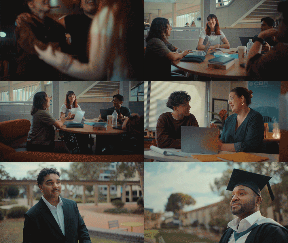
U CAN @ UC Campaign
‘U CAN @ UC’ was about speaking to new audiences for the University of Canberra. At its heart were UC’s communitarian values: the belief that education should be accessible, practical and open to people from all walks of life. So instead of talking like a traditional prestige university, with the usual legacy and sandstone cues, we made the campaign feel more personal, following a number of different characters on their journey to higher education.
Client:
University of Canberra
Project Role:
Art Direction
(TVC & photography),
Design, Copy, Scriptwriting
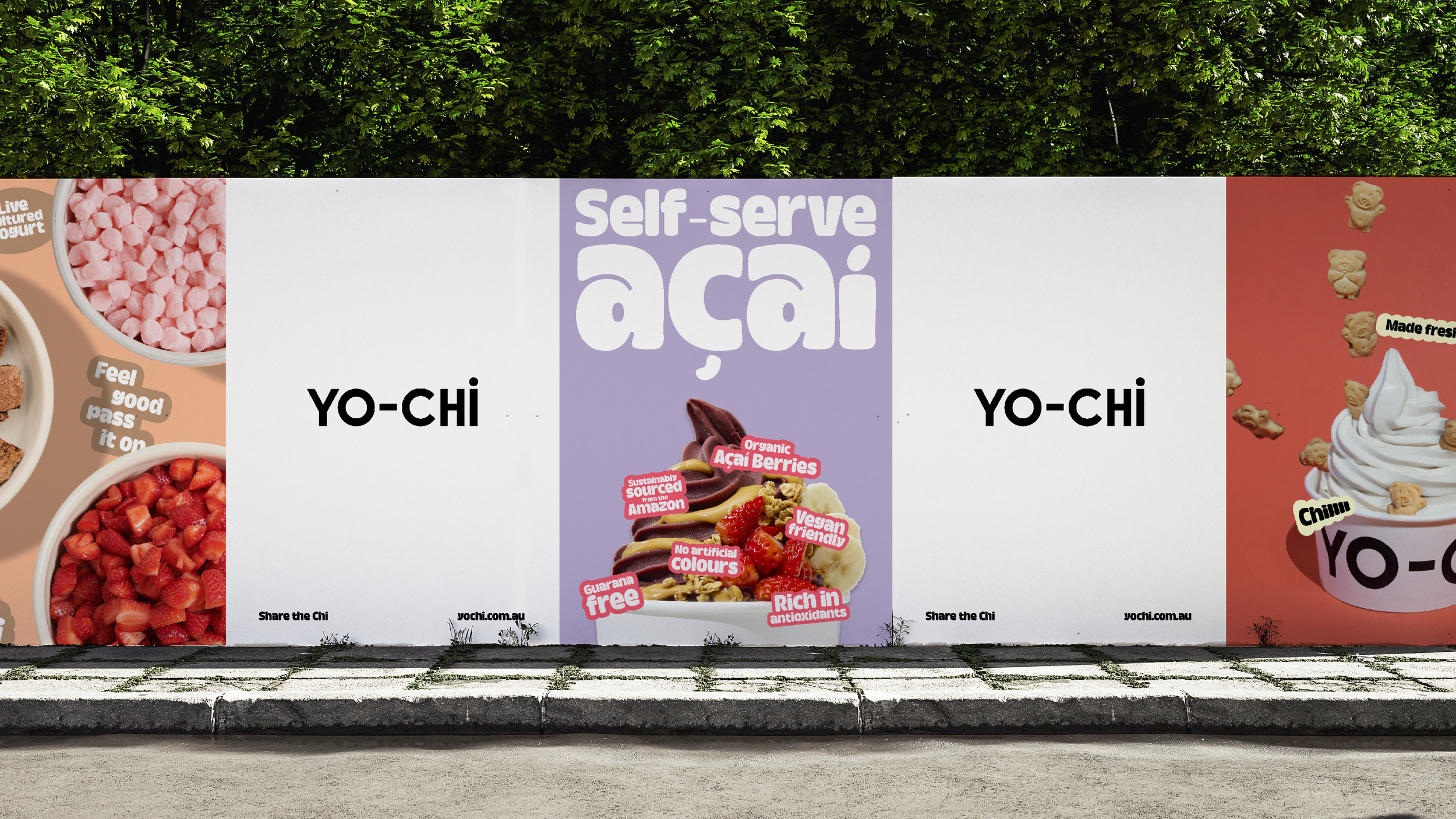

Yo-Chi Brand Refresh
Yo-Chi was a client very close to my heart (and stomach). They came to us looking for a brand refresh that kept the parts people already loved, while giving the brand a fresher, more youthful feel. Taking inspiration from Yo-Chi’s signature toppings, we developed a playful sticker system. This added fun & flavour, giving it more personality across every touchpoint. The hardest part was working on it with an empty stomach.
Client:
Yo-Chi Frozen Yoghurt
Project Role:
Art Direction,
Design Lead
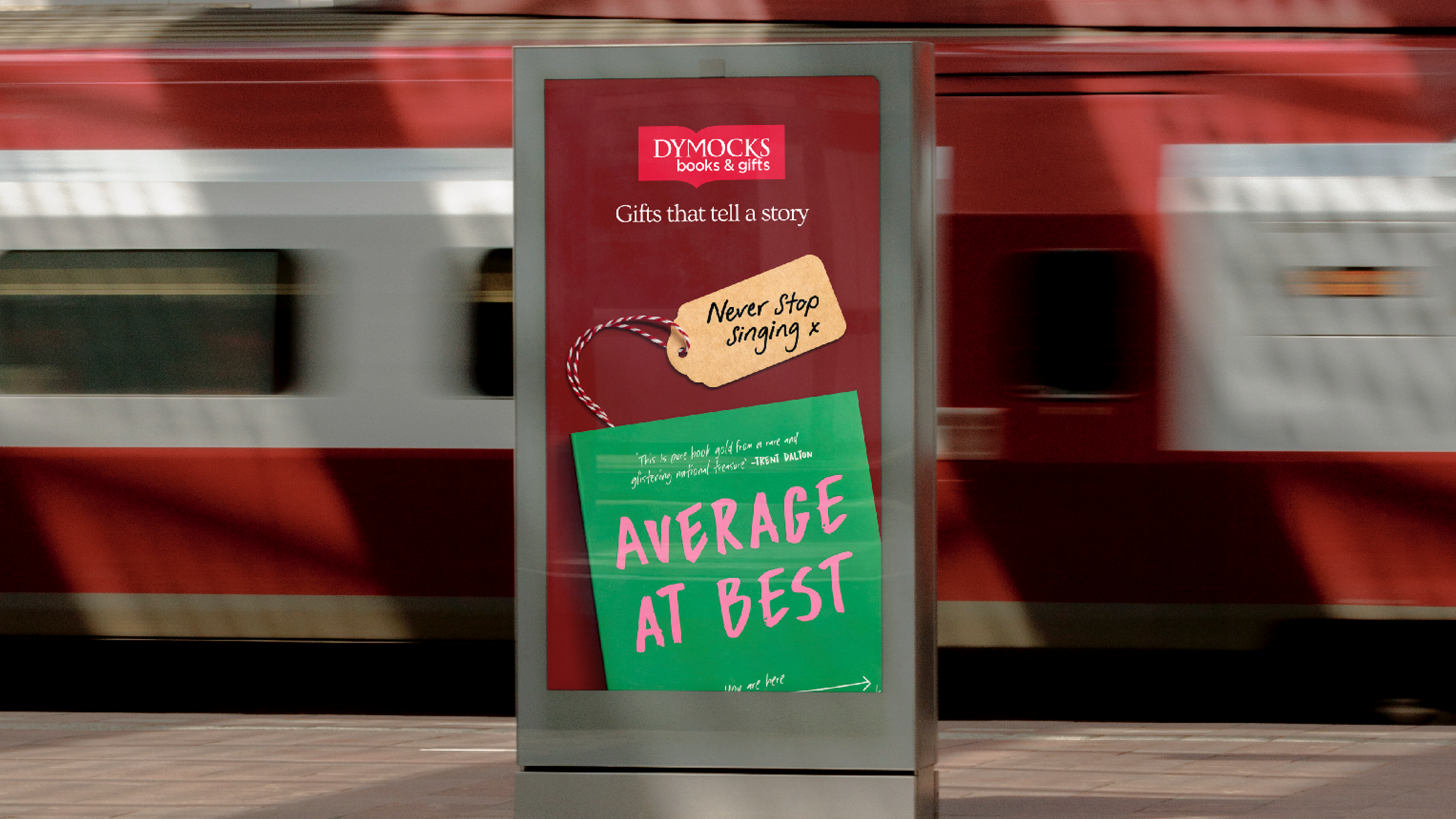
Gifts that tell a story Christmas Campaign
You have to know someone to know which book they’ll genuinely enjoy. So when Dymocks approached to us for their Christmas campaign, I wanted the work to feel personal. ‘Gifts That Tell a Story’ celebrated the little things people know about the ones closest to them, imagining the kinds of messages loved ones might write to each other at Christmas…even if they were a little bit sassy.
Client:
Dymocks Books
Project Role:
Creative Direction,
Design lead,
Copy
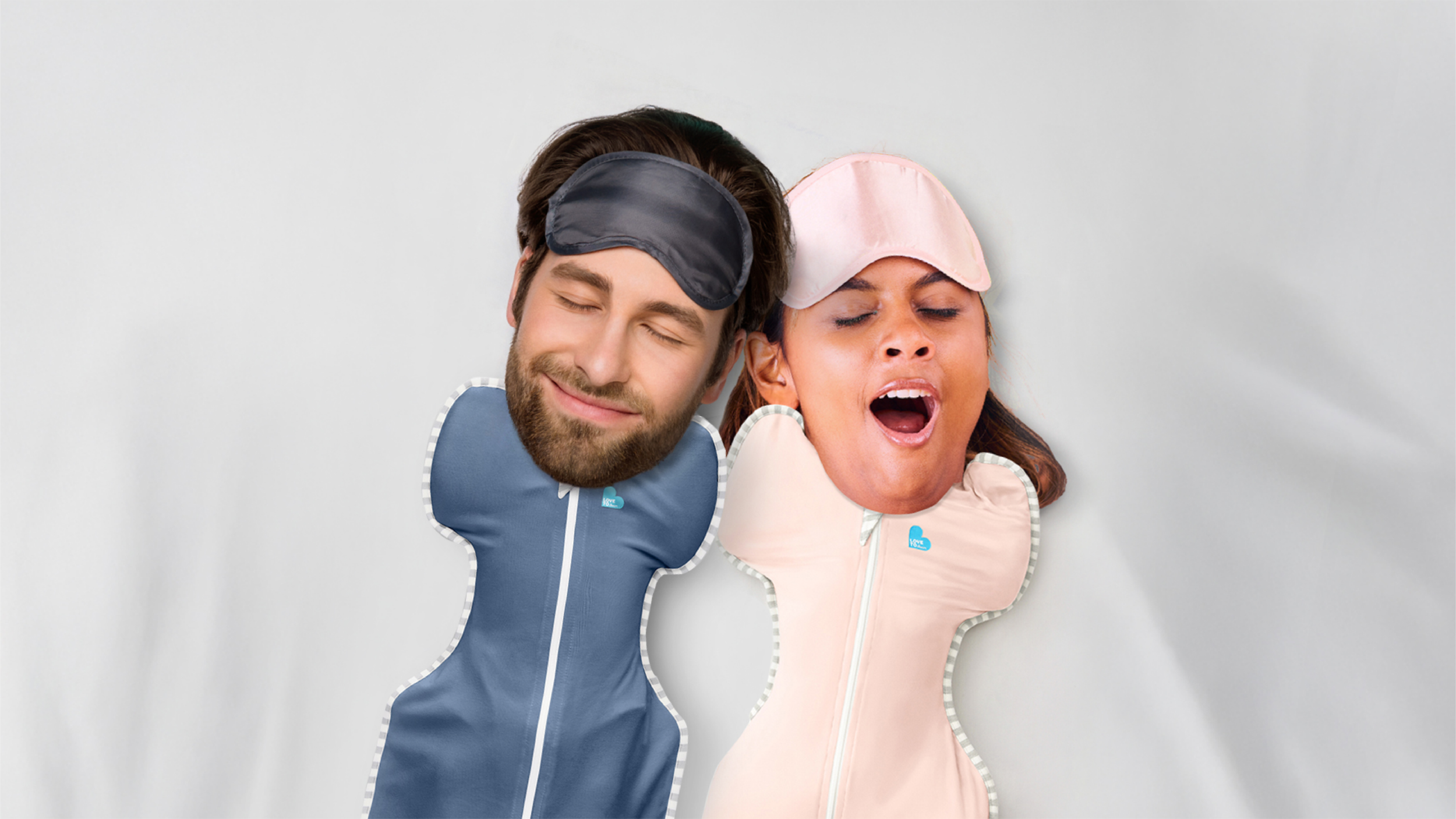
Sleep like a baby Campaign
Adult heads on babies was not an ad I imagined getting over the line in my career, but alas, here we are. Love to Dream had created the perfect sleep suit for babies, but the insight was really about parents. As one of the most sleep-deprived demographics out there, they were the real winners of a better night’s sleep. The idea featured the product front and centre, while still letting parents see themselves. What started as a small series of static ads grew into a second video asset, after the Love to Dream team loved the concept so much.
Client:
Love to Dream
Project Role:
Creative Direction,
Design lead,
Copywriting
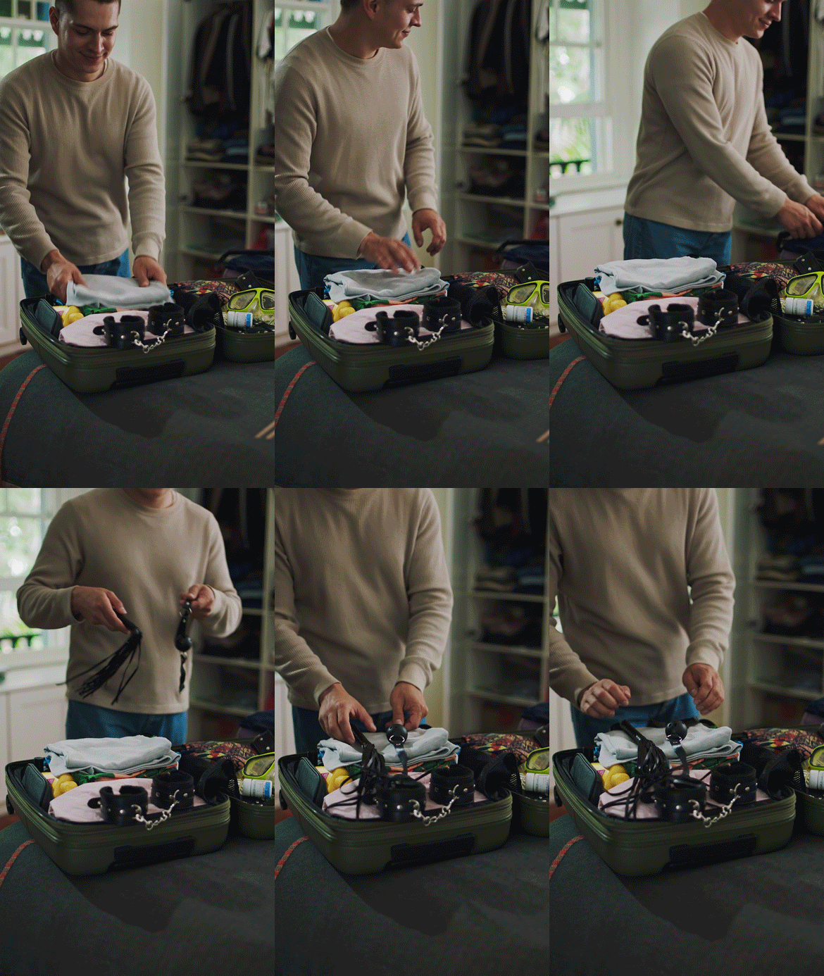
‘Protect Your Play’ was a campaign created with Emen8 in response to the mpox outbreak in Australia. The brief came with a tricky balance: give people the information they needed, without making it feel scary, clinical or judgemental. Speaking to gay and bisexual men who have sex with men, the campaign took a sharp, cheeky and practical approach. Four 15-second videos covered the essentials: vaccination, signs and symptoms, transmission and travel.
Protect your play Public Health Campaign
Client:
Emen8
Project Role:
Creative Direction,
Design lead,
Copy,
Scriptwriting
Absurdly Good Launch Campaign
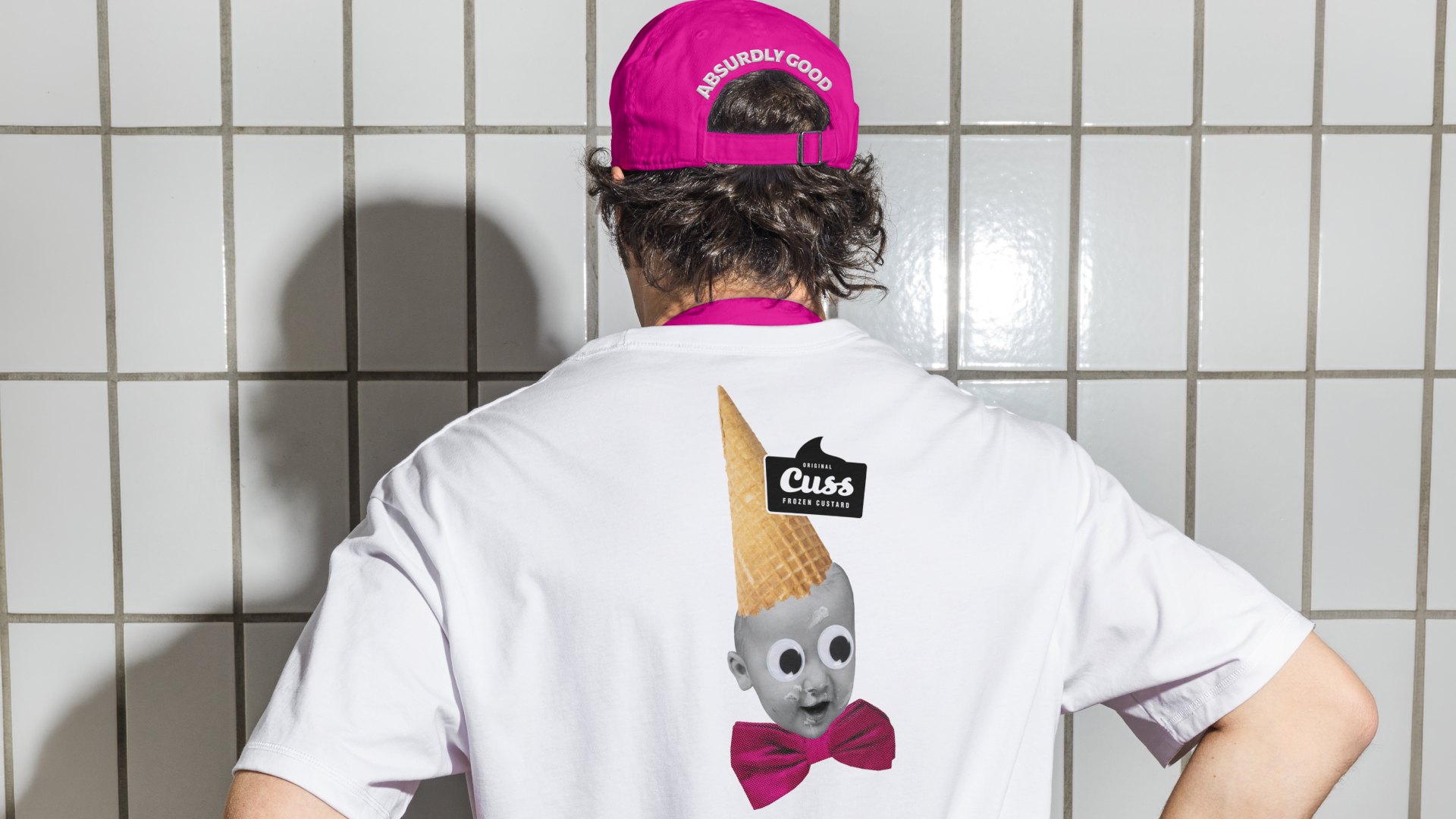
Frozen custard isn’t really a thing in Australia. To most of us, custard is the thing that comes out at Christmas, poured over a cake your nan made. So when I tried CUSS for the first time, I was genuinely taken aback by just how good it was. It completely changed what I thought custard could be. And from there, ‘Absurdly Good’ was born. This campaign launched CUSS’s frozen custard to Australians by leaning into that same feeling of surprise. I wanted the art direction to feel intriguing, unexpected and a little bit surreal, which is why you’re about to see dancing cats…
Client:
CUSS Frozen Custard
Project role:
Creative Direction,
Design lead,
Copywriting
Another reason EOFY Campaign
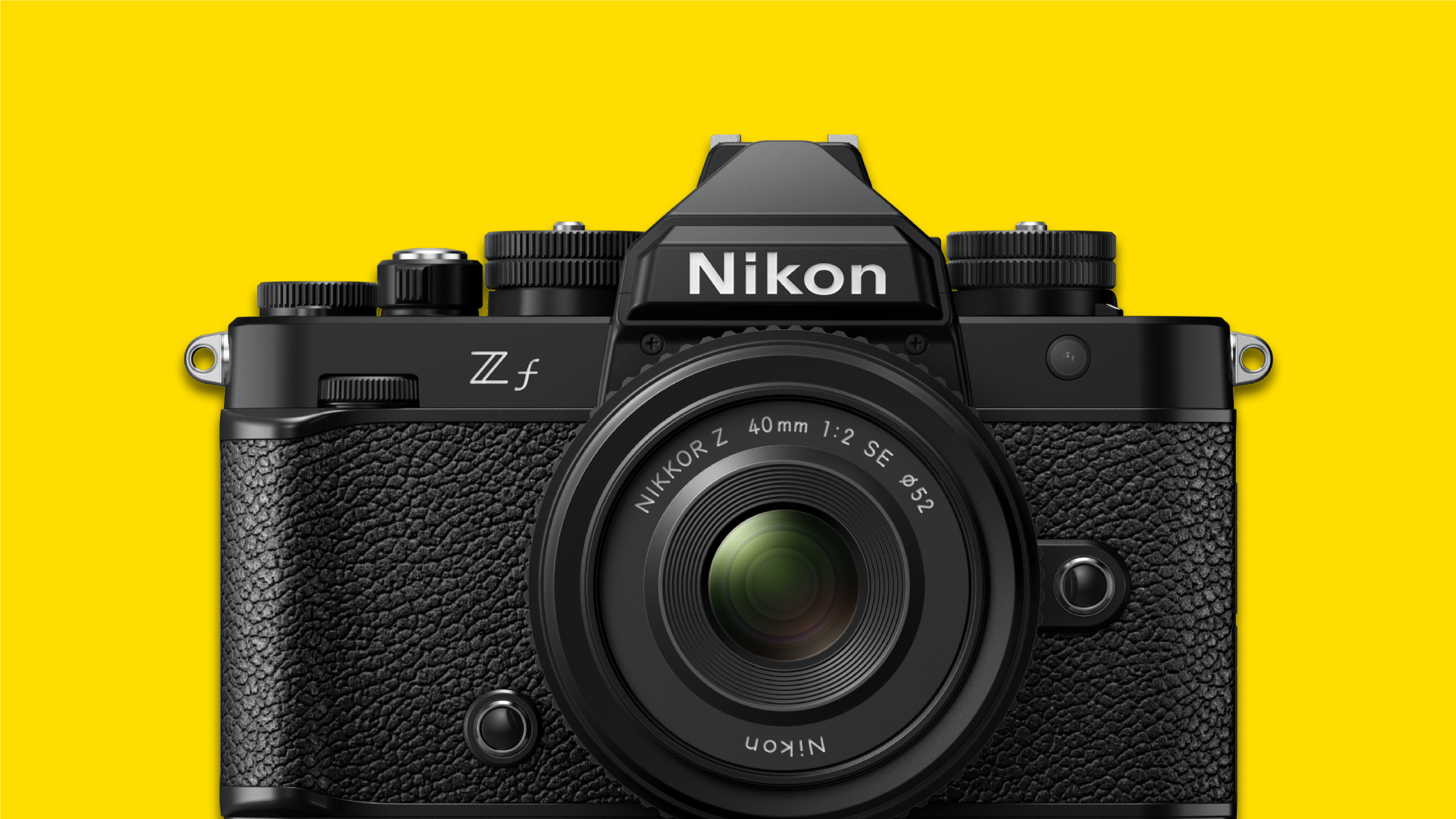
With 100 years of heritage and innovation behind them, Nikon already had plenty of reasons to believe. The EOFY sale was just one more. This campaign was inspired by Nikon’s iconic copy-led campaigns from the ’90s and early 2000s, allowing the campaign to offer a more considered take on EOFY. No flashy red sale messaging and shouting about savings, we’re sick of them!!
Client:
Nikon Cameras
Project role:
Creative Direction,
Design lead,
Copywriting
Get covered in butter Campaign
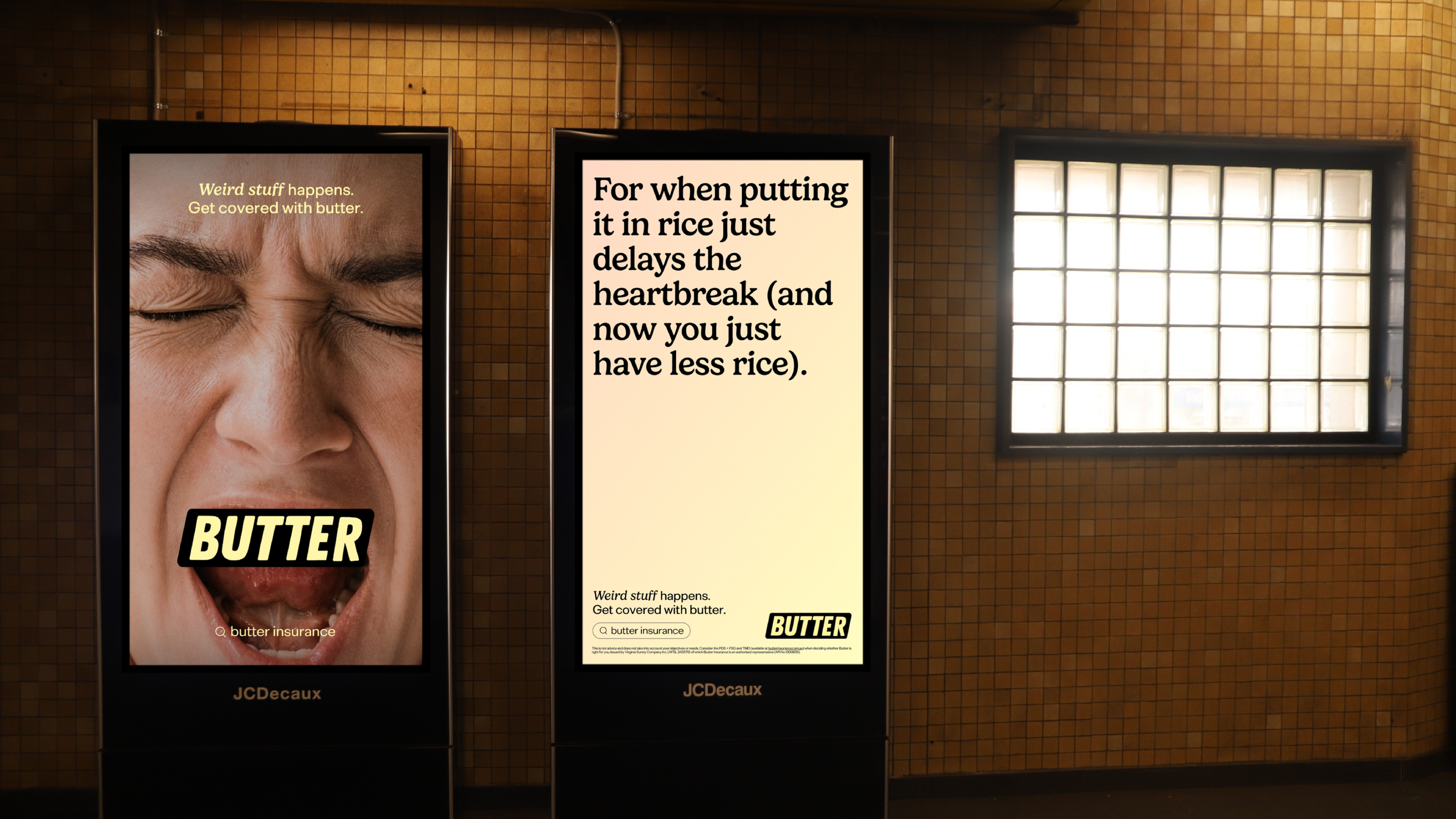
If you ask people what their most valuable item is, their phone would probably be at the top of the list. But most people don’t ensure them. Enter Butter: insurance built for the things people actually care about, the everyday essentials that rarely leave their side. The challenge was speaking to an audience that had probably never considered insurance in the first place. So the campaign leaned into the everyday chaos they know well, using shocked reactions and playful copy to make insurance feel a little less serious. And it worked. The campaign led to a 175% increase in website users and a 656% surge in sales.
Client:
Butter Insurance
Project role:
Art Direction,
Design lead,
Copywriting