’Yo-Chi Brand Refresh’, 2025
{ Via Born the Agency }
Project Role:
Art Direction,
Design
Brief Yo-Chi needed a fresher, more youthful identity that retained the recognisable elements customers already loved. The challenge was to create a more cohesive brand experience, particularly in-store.
Insight The fun of Yo-Chi is in making it your own, with endless combinations of flavours and toppings. That same sense of individuality could become the foundation of the brand's visual identity.
Concept Build on Yo-Chi's existing personality with a playful, toppings-inspired identity that celebrates choice, creativity and self-expression.
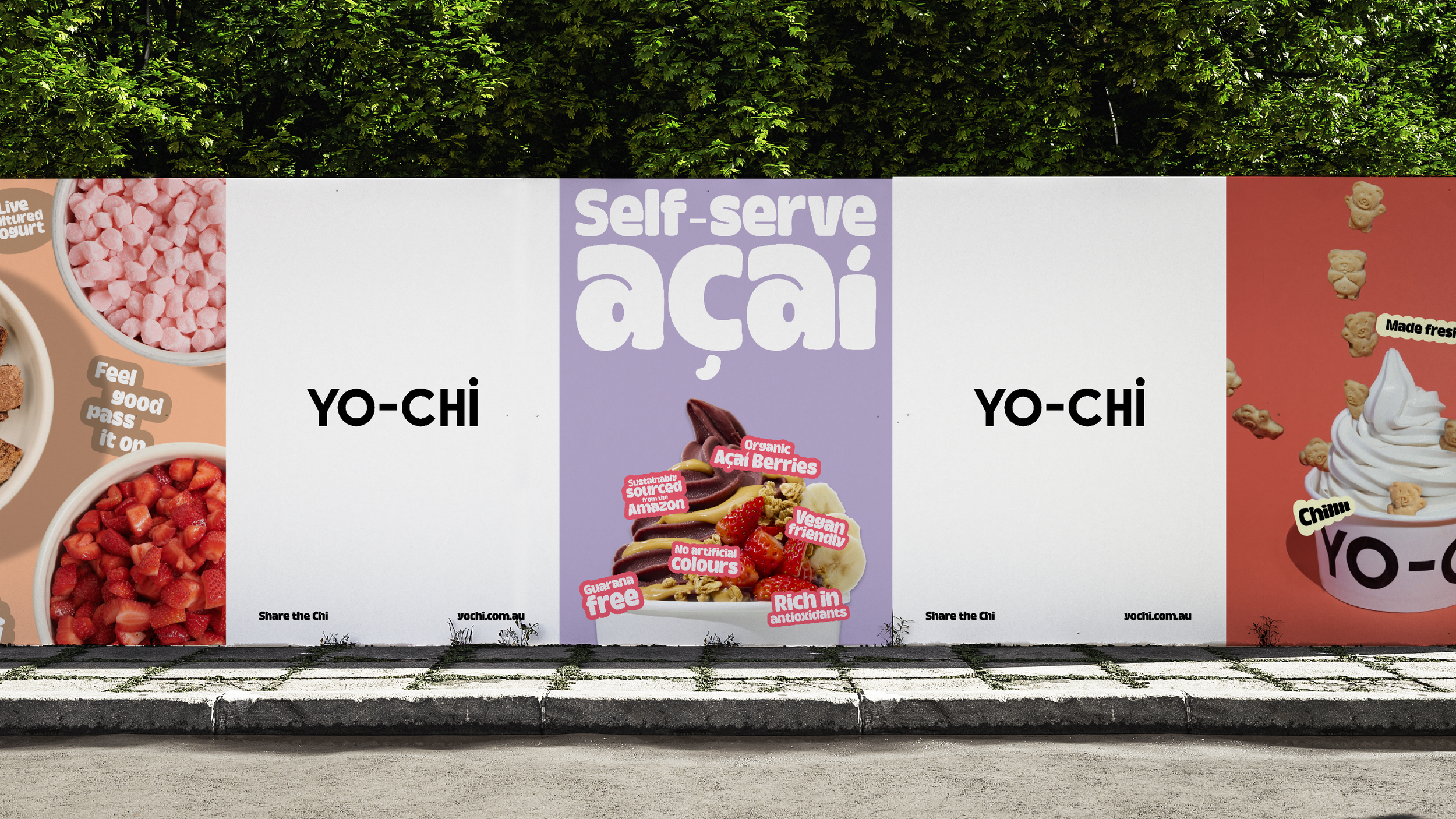
Execution A streamlined identity introduced refreshed typography, colour and an expanded sticker system, giving the brand greater consistency. The system rolled out primarily across in-store environments and POS, with the bear mascot playing a bigger role.
Impact The refresh created a more cohesive and contemporary brand experience, bringing greater consistency and personality to the customer journey.



Additional Credits
Design Director: Scott Wrightson
Copy: Kerryn Miller